New surfskis from Nordic Kayaks...
Monday, November 19, 2012, 2 comments

Nordic Kayaks has three surfskis on the market for 2013. Rapido is already available, the first Breeze has just arrived in Sweden and the top model will be available sometimes during the spring. The pictures show the final design scheme. For more information, take a look at Nordics site.

Nitro

Rapido 2.0

Breeze
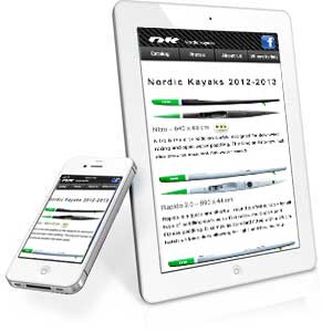
I have also assisted in updating the Nordic Kayaks site – implemented one of my pet ideas: responsivity, meaning that the site responds to the different screen sizes and resolutions of the new internet devices: featurephones, smartphones, surfing and reading pads etc. Images, text boxes and design elements are scaled to fit the screen area, and they are arranged to simplify navigation and reading.
 The keywords are "mobile first" – mening that the site is developed on and for small screens, and then adapted to large screens in step two. The reason for this is that mobile is exploding, and will soon overtake large screen internet use, that the snartphones have access to features that can be used to enhance the experience and minimize the otherwise necessary manual input (f x precise location information from GPS, user orientation from a digital compass, multi-touch input, device positioning from an accelerometer, camera) and that focussing on the key tasks the users want to accomplish without the periferal paraphernalia that litters many large-screen web sites will provide good user experience and will be good for business.
Technically it is done by having the browser ask for the svreen sice and resolution and serving the relevant style rules (may look like this in different devices).
The mobile web affects not only the presentation, but also the functionality on a deeper level: how the site is used and for what. The visits are genarally shorter and more focussed, more oriented at achieving a purpose. Customers getting used to the functional efficiency of the best mobile apps, are increasingly put-off by the often bloated desk top oriented web sites. In the future we will likely (hopefully) see the same functional efficiency all over the internet (but considering that there still are splash screen, table layouts, flash sites, inline styling etc out there it will take a long long time ;-). This will in no way exclude aesthetic qualities, nor will it detract from the experience or lessen the richness of available information: but it may need to be presented in a more perspicuous way, where the most sought-for information is closely at hand and the most performed tasks (contact information, search for data, ordering, purchasing etc) are available intuitively and with a minimum of clicks or taps.