Web job...
Thursday, November 10, 2011, 2 comments
Do not know if someone has seen it, but I have been busy with some small tasks on the site lately. A little visual refining here and there: quotation boxes, buttons and navigational elements have got gradients, shadows and highlights – things that now can be done efficiently with CSS.
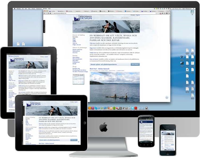
But more important is that the site now is responsive. It adjusts the layout and presentation to the width and resolution of the screen on desktops, laptops, pads, smartphones and feature phones, and depending on whether these small devices are held vertically or horisontally.
Practically the font size adjusts to the resolution, the images to the width, the two columns becoming one below a certain screen width, inline elements becoming block elements etc – all achieved by the css-file asking the browser about the screen width and resolution and then serves the relevant formatting instructions.
One disclaimer! I have tested the site in just one smartphone yet. There will probably be a some bugs showing up in other devices. I will of course sort them out when I have had the opportunity to test more phones and pads – but I am grateful for an alert if something seems weird in your phone.